One of the main highlights of the 3.0 release of Zabbix is a much awaited visual overhaul of the front-end interface. Our main effort was to introduce a more lightweight, less cluttered UI and not alienate our users.
Sure, there may have been two approaches: a radical redesign and an incremental change with every future release. We think that the right approach for us lies in between with one special ingredient added to the mix: understanding what our users want and how they use Zabbix. We believe this approach will fundamentally improve the quality of the interface we ship with our product
Evolution of Design
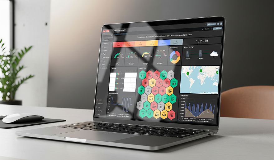
Now you can enjoy a much cleaner and more modern look. The front-end is better optimised for high resolution displays and is more lightweight.
Additionally, we have put a lot of effort to create color themes that would look great in different environments. Some of you may particularly enjoy the dark theme, besides the fact that it looks good it also helps to ease the eye strain.


Next up: readability. This is crucial for overseeing large amounts of data. You may notice a change in font face and size, more white space, less cluttered. All these measures help bring the most essential information to light.
We will focus our efforts around the core functional elements of the interface. Our goal is to make them easy to use, beautiful and scalable across multiple screen resolutions.
While these are only some of the design improvements we are going to introduce in Zabbix 3.0, an equally important part of equation is a great user experience in general. Design evolution of both the visual and technological sides of Zabbix front-end will be an ongoing journey. We are very enthusiastic to take you with us.

Path to a Good Design
Visual overhaul is a great deal for a product with a long legacy. Sometimes it takes an extra effort to make certain decisions to change any established UI patterns of the product. We would like to continuously learn how the product is used in real life and improve based on these discoveries, reaching a more intuitive but familiar user experience across the whole interface.
While there is definitely room for improvement, it should be based on the real usage patterns so we don’t overwhelm our users. It is really an exciting time to be part of Zabbix community as major improvements that will change how you work with Zabbix will be coming out in the future.
See other improvements of the Redesigned web interface.
Get acquainted with Encryption and Trend prediction features in our previous blog posts.
Also find more about the new features introduced in Zabbix 3.0 on the What’s New page.
This article is available in Russian, on habrahabr.ru