If you’ve ever monitored network switches in Zabbix, you know perfectly well that the data is there. Interfaces are polled via SNMP, triggers fire when a port goes down, and events are logged. Technically, everything works.
But when you open a 24- or 48-port switch in Zabbix, you’re usually looking at a list of interface items or triggers. It’s accurate, but not visual. You still need to read through interface names to understand what’s happening. During an incident, that costs time.
Of course, you can create network maps for each switch, draw every port on it etc, but that takes a lot of time and is tedious if you have many devices.
That’s why we created the Zabbix Widget Switch.
Instead of presenting interface states as text, the widget renders a visual representation of the switch directly inside a Zabbix dashboard. Each port is displayed as a graphical element, color-coded according to its operational state.
Green means up.
Red means down.
Grey means disabled or unused.
You immediately see the health of the entire switch — without scrolling, filtering, or interpreting tables.
Designed for real environments
This widget is not just a static visual block. It was designed with real operational use in mind.
You can:
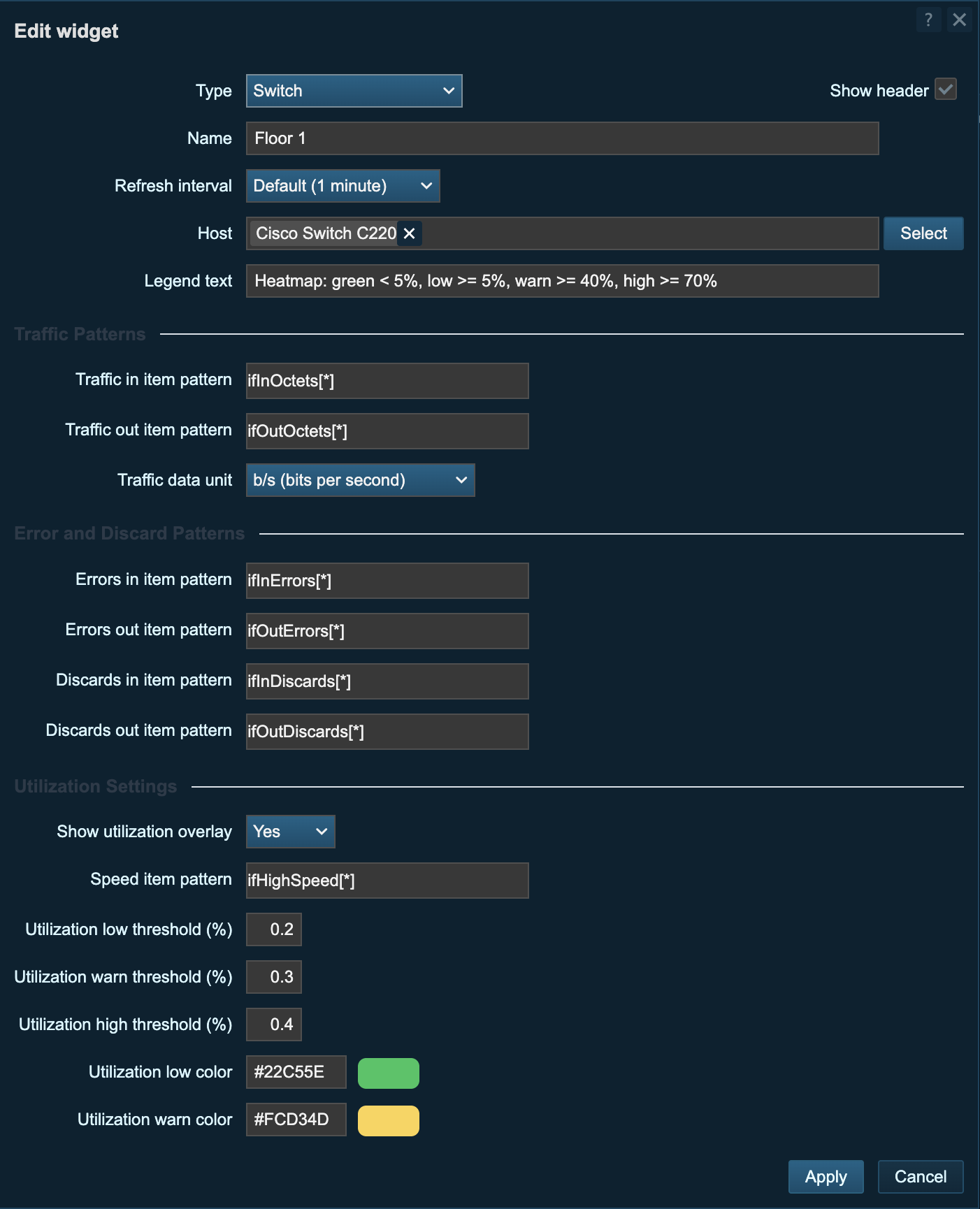
- Reuse shareable switch profiles across devices
- Save profile presets directly from the edit form
- Configure rows, ports per row, SFP count, and port index start
- Support mixed RJ45 + SFP layouts with realistic placement
- Add port labels (uplinks, APs, user links, etc.)
- Show a utilization heatmap overlay with configurable thresholds and colors
- Display a live panel with IN/OUT sparklines, current utilization, 24h online state bar, and 24h errors/discards bars and trend summaries
- Configure traffic/error/discard/speed item patterns
- Use item-key suggestions in the edit UI for faster setup
- Choose traffic unit display (B/s or bps)
- Show switch summary context (CPU, uptime, serial, software, VLANs, monitoring state, maintenance badge)
This makes it practical for real-world deployments, not just lab environments.
If you manage dozens of similar switches, profiles save time and keep dashboards consistent.
If you run a NOC screen, the legend ensures clarity for everyone.
If you monitor mixed copper and fiber ports, SFP support makes the layout realistic.
It adapts to how your network is built.
Why it matters
Monitoring is about reducing reaction time.
When a user says, “My connection dropped,” you don’t want to search through interface lists. You want to open the dashboard and immediately see that port 17 is red.
In NOC environments, a visual layout is even more powerful. A quick glance at the screen tells you whether everything is healthy or if some uplink needs attention.
And during maintenance windows, a before and after check becomes an instant visual validation.
How it looks
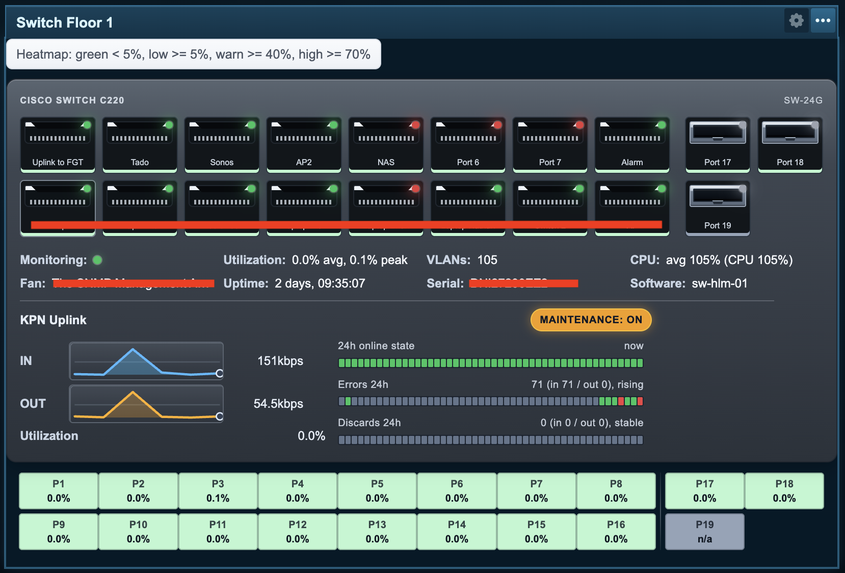
A visual overview like this makes the state of a switch immediately obvious, even from across the room.
Open source
The Zabbix Widget Switch is open source and available for Zabbix 7.0 on GitHub:
https://github.com/OpensourceICTSolutions/zabbix-widget-switch
Feel free to test it, adapt it, or contribute.
I hope this widget will be helpful! If you have any questions or need help configuring anything on your Zabbix setup feel free to contact us at Opensource ICT Solutions.
Patrik Uytterhoeven
Disclaimer: Parts of this software were generated using Codex. We do not guarantee the total accuracy, security, or stability of the generated code.