In this blog post, we would like to show you a new theme that might seem a little familiar to you. Let’s take a little nostalgic trip down memory lane and take a look at this special frontend theme for Zabbix 5.4 reminiscent of Zabbix 1.8.
How it looks
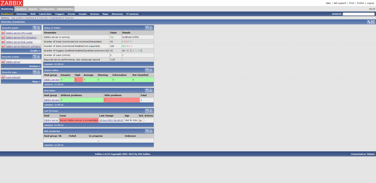
Although the old Zabbix 1.8 design understandably has an outdated look, the colors have a nice feel to them, especially the old shade of blue.
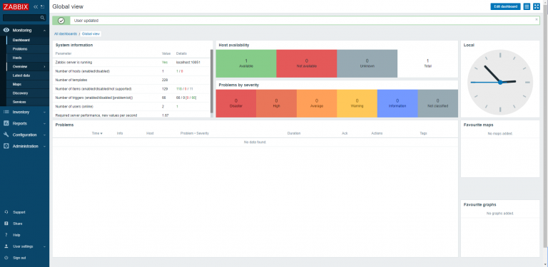
The Zabbix 5.4 design is up to date with current standards and has a modern look and feel to it. It is meant to be simplistic with a lot of white and barely any color except for the navigation bar and widgets like the problems and availability.

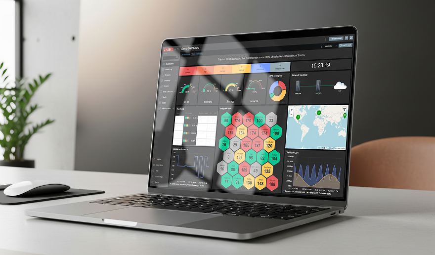
My theme combines the two. It is up to date with modern standards, and it has a trusted feel to it with the old color scheme. The old color scheme gives us a nostalgic look, which will hopefully bring some joy both to the veterans and newcomers to Zabbix!
How it works
The way I made this was fairly simple. I copied a css file from the styles folder, placed it in the same folder, and renamed it. I also put the image used to change the appearance into the same folder so it is easy to find.
blue-theme.css
dark-theme.css
hc-dark.css
hc-dark.css
oldisnew.css
table_head2.gif
To figure out which changes should be made, I had the Zabbix GUI open in a web browser with the element inspect function. in the css file I would find the same tag/name/class/etc as in the web browser and change it to look like the appearance of version 1.8.
.menu-main > li {
line-height: 16px; }
.menu-main > li.is-selected > a {
background: url(../styles/table_head2.gif) repeat-x top left;
border-left-color: #87d1ff;
color: #ffffff; }
.menu-main > li.is-expanded > a, .menu-main > li.is-expanded > a:focus {
border-left-color: transparent;
color: #ffffff; }
.menu-main > li:not(.is-expanded) .submenu {
max-height: 0 !important; }
.menu-main > li > a {
background:url(../styles/table_head2.gif) repeat-x top left;
color: #ffffff; }
For example here is where I changed the background of the dropdowns from the side menu into the image from Zabbix 1.8 which gives the menu an appealing new look.
For the theme to show up in the User settings it uses an add-on for the APP.php.
class APP extends ZBase {
   public static function getThemes() {
   return array_merge(parent::getThemes(),
   ['oldisnew' => _('Old is New')]);
}
}
The add-on is included in our Github Repository, you can copy and paste it into the APP.php file.
I hope you like the theme. It is available for download at the Opensource ICT Solutions Github. Just follow the link below:
https://github.com/OpensourceICTSolutions/zabbix-5-old-version-1_8-theme .
The Github contains an up-to-date Readme for installation, but, here is a short explanation on how to install it:
1. Navigate to the link above.
2. Download the three files: (oldisnew.css),(tablehead2.gif) and (APP_add_on.text).
3. On your Zabbix server CLI there should be a directory called /usr/share/zabbix/assets/styles/. Put the (oldsinew.css) and (tablehead2.gif) files here.
4. For (APP_add_on.txt) add the text to the APP.php located at the directory /usr/share/zabbix/include/classes/core/ inside of (class APP extends ZBase). (this allows you to actually see the theme inside of the dropdown.)
5. Now, at the Zabbix GUI navigate to Profile under User settings and change the theme.
6. Enjoy your new theme!


 Prev Post


