


One of the great advantages of Zabbix is its extensible and modular architecture. This allows the platform to be enhanced with third-party modules, significantly expanding its functionalities without compromising the stability of the core system. The ECharts-Zabbix module is an excellent example of this flexibility in action.
Table of Contents
What is the ECharts-Zabbix module?
ECharts-Zabbix is a module that adds customizable widgets to Zabbix, using the ECharts library to create interactive and dynamic visualizations of your monitoring data. This module complements Zabbix’s standard visual capabilities, enabling richer and more informative graphical representation of complex monitoring environments.
What are the key features available with ECharts in Zabbix?
By integrating ECharts and Zabbix, you gain access to:
- Multiple chart types (line, bar, pie, gauge, scatter, heatmap, and more)
- Complete customization of colors, styles, legends, and tooltips
- Fluid animations for a better user experience
- Compatibility with Zabbix light and dark themes
- Direct integration with data without the need for external tools
- Responsive visualizations that adapt to different screen sizes
- Helper functions for data formatting and dynamic color generation
Installation and configuration
Installing modules in Zabbix is easy thanks to the platform’s flexibility:
- Download the module from the official repository
- Extract the files to the modules folder of your Zabbix server
- In the Zabbix frontend, go to Administration > General > Modules
- Find the ECharts-Zabbix module in the list and click “Enable”
- The widget will be available for use in Zabbix dashboards and screens
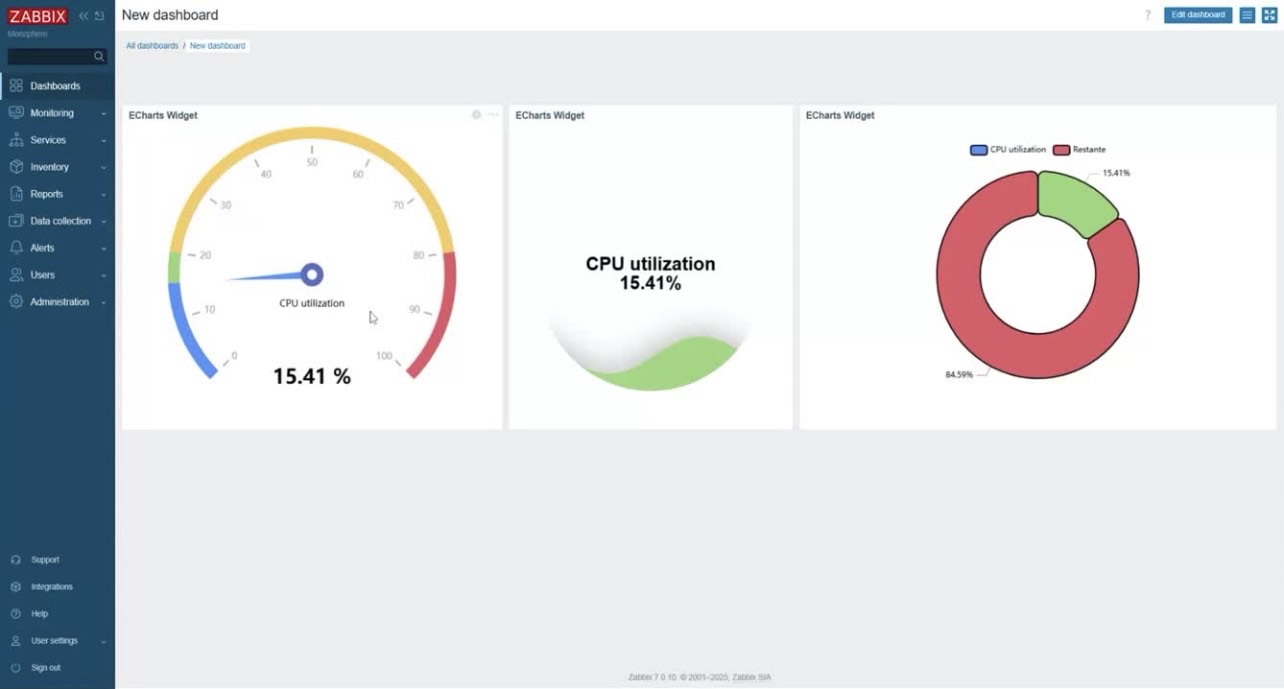
Practical use cases
Server performance monitoring with Gauge charts
Gauge charts are ideal for visualizing metrics such as CPU, memory, and disk usage. The flexibility of Zabbix combined with ECharts allows you to create impressive visual panels that clearly show the current state of these metrics:
```javascript

const field = context.panel.data.series[0].fields[0];

const value = field.value;

const gaugeData = [{

  value: value,

  name: field.name,

  title: {

    offsetCenter: ['0%', '30%']

  },

  detail: {

    offsetCenter: ['0%', '60%']

  }

}];

return {

  backgroundColor: 'transparent',

  series: [{

    type: 'gauge',

    startAngle: 90,

    endAngle: -270,

    center: ['50%', '50%'],

    radius: '90%',

    pointer: {

      show: false

    },

    progress: {

      show: true,

      overlap: false,

      roundCap: true,

      clip: false,

      itemStyle: {

        borderWidth: 0

      }

    },

    axisLine: {

      lineStyle: {

        width: 20,

        color: [[1, 'rgba(255,255,255,0.1)']]

      }

    },

    splitLine: {

      show: false

    },

    axisTick: {

      show: false

    },

    axisLabel: {

      show: false

    },

    data: gaugeData,

    title: {

      fontSize: 14,

      fontWeight: 'normal'

    },

    detail: {

      width: 80,

      height: 20,

      fontSize: 14,

      fontWeight: 'normal',

      borderWidth: 0

    }

  }]

};

```
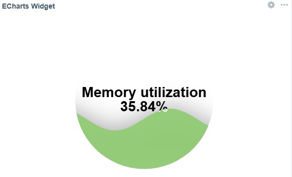
Liquid fill chart example
This chart type is great for visualizing percentage-based metrics, like disk usage or SLA compliance, in a visually appealing way:
```javascript

if (!context.panel.data.series || !context.panel.data.series[0] || !context.panel.data.series[0].fields) {

    console.error('Dados não disponíveis no formato esperado');

    return {};

}

const field = context.panel.data.series[0].fields[0];

return {

    backgroundColor: 'transparent',

    series: [{

        type: 'liquidFill',

        data: [field.value / 100],

        radius: '80%',

        color: ['#91cc75'],

        backgroundStyle: {

            color: 'rgba(255, 255, 255, 0.1)'

        },

        label: {

            formatter: function() {

                return field.name + '\n' + field.value.toFixed(2) + field.units;

            },

            fontSize: 28,

            color: 'black'

        },

        outline: {

            show: false

        }

    }]

};

```
Below are some other visualization examples available on our github:
Colors and gradients
You can use simple hexadecimal colors or create sophisticated gradients:
```javascript

// Linear gradient

new echarts.graphic.LinearGradient(0, 0, 0, 1, [

  { offset: 0, color: '#83bff6' },

  { offset: 1, color: '#188df0' }

])

```
Number formatting
Format your numerical data as needed:
```javascript

// 2 decimal places

formatter: function(value) {

  return value.toFixed(2) + field.units;

}

// Using context helper

formatter: function(value) {

  return context.helpers.formatNumber(value, 2) + field.units;

}

```
Element positioning
Precisely control where elements are displayed:
```javascript

// Centered

offsetCenter: [0, '70%']

// Custom grid

grid: {

  top: '5%',

  left: '3%',

  right: '4%',

  bottom: '3%',

  containLabel: true

}

```
The Zabbix module ecosystem
Zabbix has a growing ecosystem of modules and integrations, developed by both the community and specialized companies like Monzphere, which contributes the ECharts-Zabbix module. This development dynamic demonstrates how Zabbix has evolved to become a truly extensible platform.
To learn more about the ECharts-Zabbix module and other solutions for Zabbix, you can visit our official GitHub repository or Monzphere’s website.
Conclusion
Zabbix’s modular architecture is one of its greatest differentiators, allowing the platform to grow and adapt to the specific needs of each monitoring environment. The ECharts-Zabbix module is an excellent example of how this flexibility can be leveraged to transform the data visualization experience in Zabbix.
For modern monitoring environments where clear and effective data visualization is essential, the combination of Zabbix with specialized modules represents a complete and adaptable solution. Try expanding your Zabbix with the ECharts module and discover how it can transform your monitoring dashboards!

I hope someone makes a tutorial on how to integrate it. Show some populated graphs inside a dashboard, and how they got the data into the graph.. I love it. Soon, we dont have to use Grafana to show the “fancy” graphs to the leaders 🙂